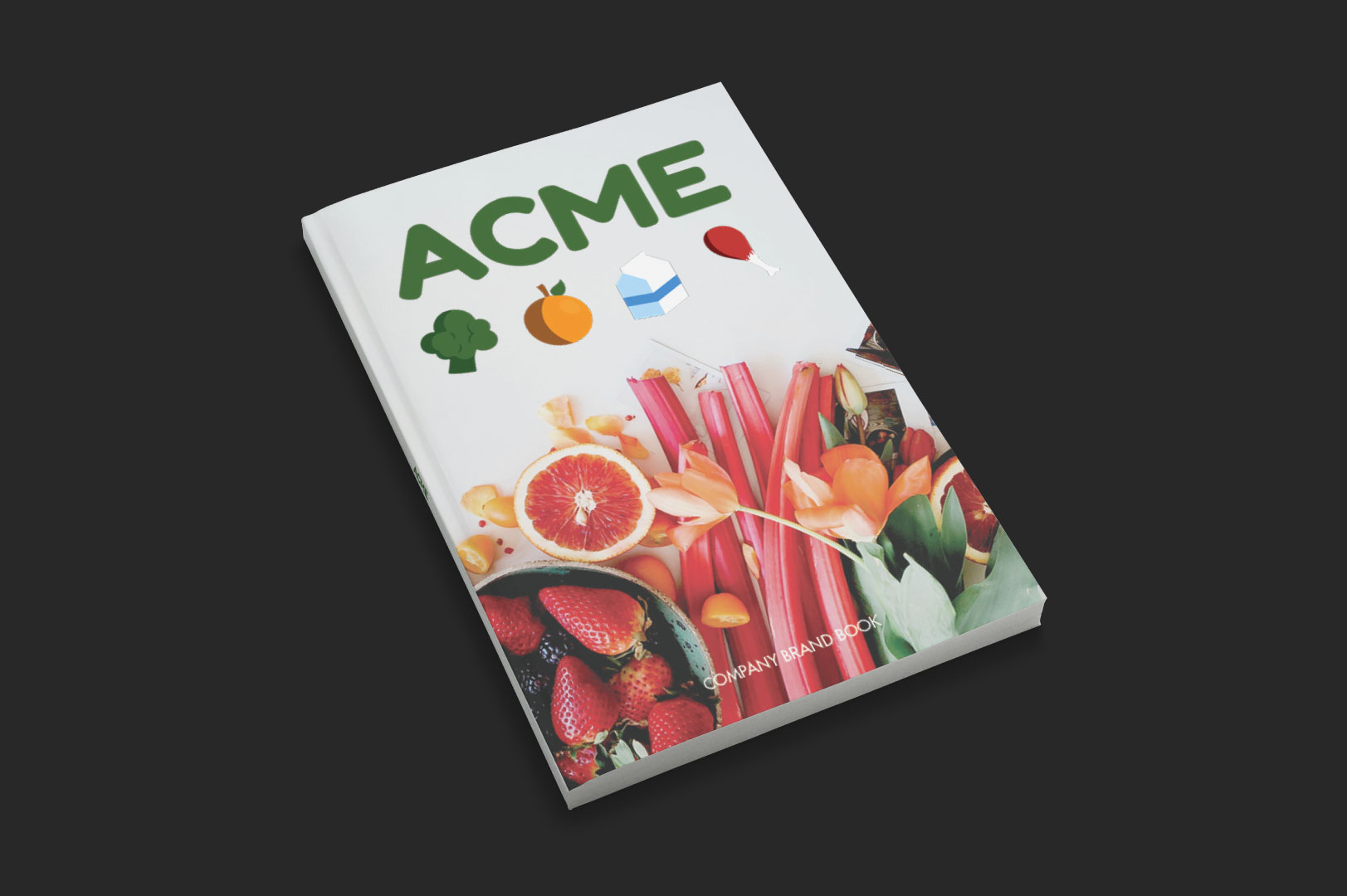
ACME GOODS
BRAND IDENTITY
Project Brief: To create a brand identity for a company called “ACME”. Each student was assigned a different industry (e.g. Grocery Store) and then challenged to design various assets (including a brand book) for that company given those parameters. Students were faced with the challenges that may arise when creating a customer focused brand identity.
Grocery stores, just like any other marketplace, have to devote a significant amount of time thinking about their product as well as their customer. I started my process by thinking about my peer’s as well as my own personal experience with buying groceries.
LOGO![]()

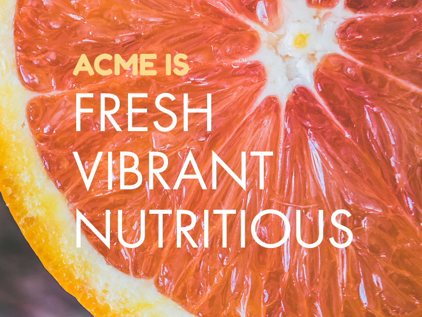
BRAND WORDS![]()
The challenge faced when creating a visual identity for ACME was finding a way to relay that brand message and make it appealing to those who may find grocery shopping intimidating- such as those who are starting to purchase their own groceries for the first time. The ACME brand had to be cross-generational.
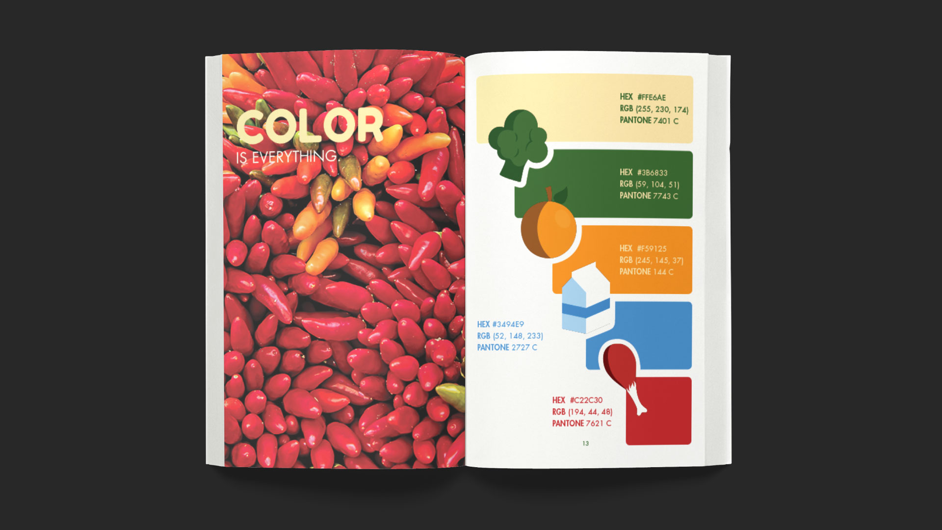
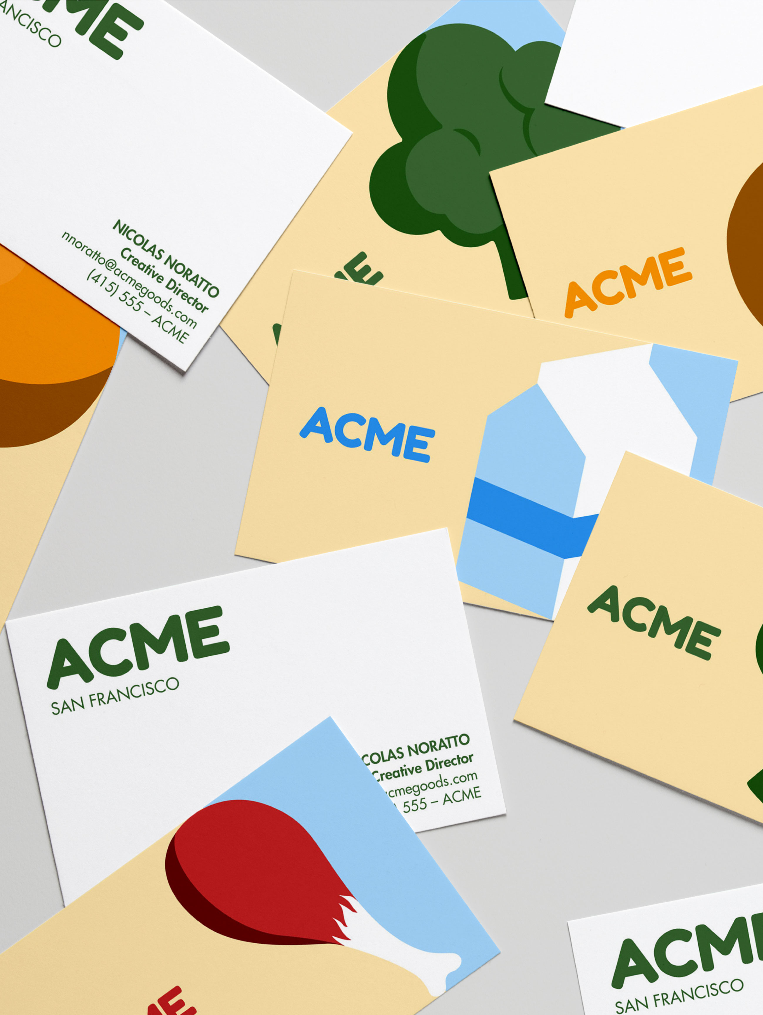
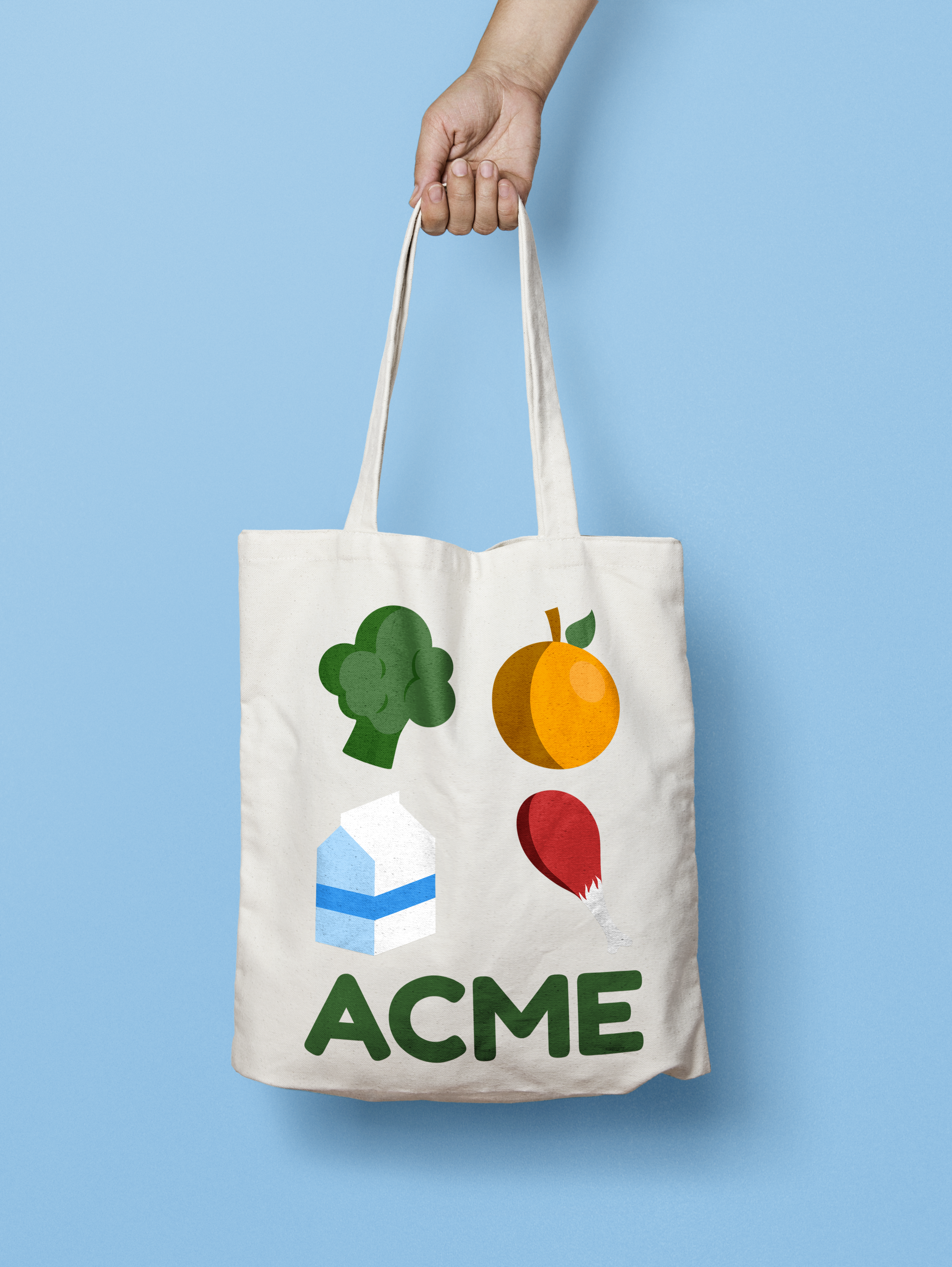
ACME’s brand identity is focused on it’s brand words: fresh, vibrant, and nutritious (just like the products it sells). Using a complementary color palate, bold lettering, and instantly recognizable iconography, the ACME brand speaks to the foundation of why choosing the right ingredients is important– because it feels good!
MERCHANDISE![]()
BUSINESS CARDS![]()