DentalXChange
Brand Identity + Visual ExpressionBRIEF
DentalXChange is leading the way in simplifying the dental payments process and helping dental providers, payers, and partners grow their businesses.
By offering a platform that streamlines administrative processes for dental offices, insurance providers, and patients, DentalXChange significantly enhances efficiency, reduces paperwork, and improves the overall experience within the dental ecosystem.
WHM Creative worked to develop a brand platform focused on bridging the gap between DentalXChange’s dedication to providing their customers with an innovative dental payments processing platform while also being a committed and trusted partner.
ROLE
My role as brand designer included working to create a visual expression that embodied DentalXChange’s new brand platform. The visual language highlights DentalXChange’s innovative but empathetic qualities and their mission to help make the dental payments process more simple for everyone.
I created the full visual expression as well as a suite of design collateral and templates that would make it easy for the DentalXChange team to hit the ground running with the new brand.
TEAM
Jonathan Byrne - Creative Direction
Patrick Moore - Art Direction
Nicolas Noratto - Design and Motion
Jonathan Byrne - Creative Direction
Patrick Moore - Art Direction
Nicolas Noratto - Design and Motion
The previous DentalXChange visual expression revolved around a logo with a red X, giving the name a negative connotation.
The new DentalXChange visual expression revolves around the idea of care and forward momentum. The logo’s X is made up of two facing arrows, alluding to the streamlined process of exchanging dental payments/data as well as the committed partnership between the platform and it’s clients.


DentalXChange is adamant on being known as a platform that works for everyone. The brand visual expression works to exemplify this in various ways.
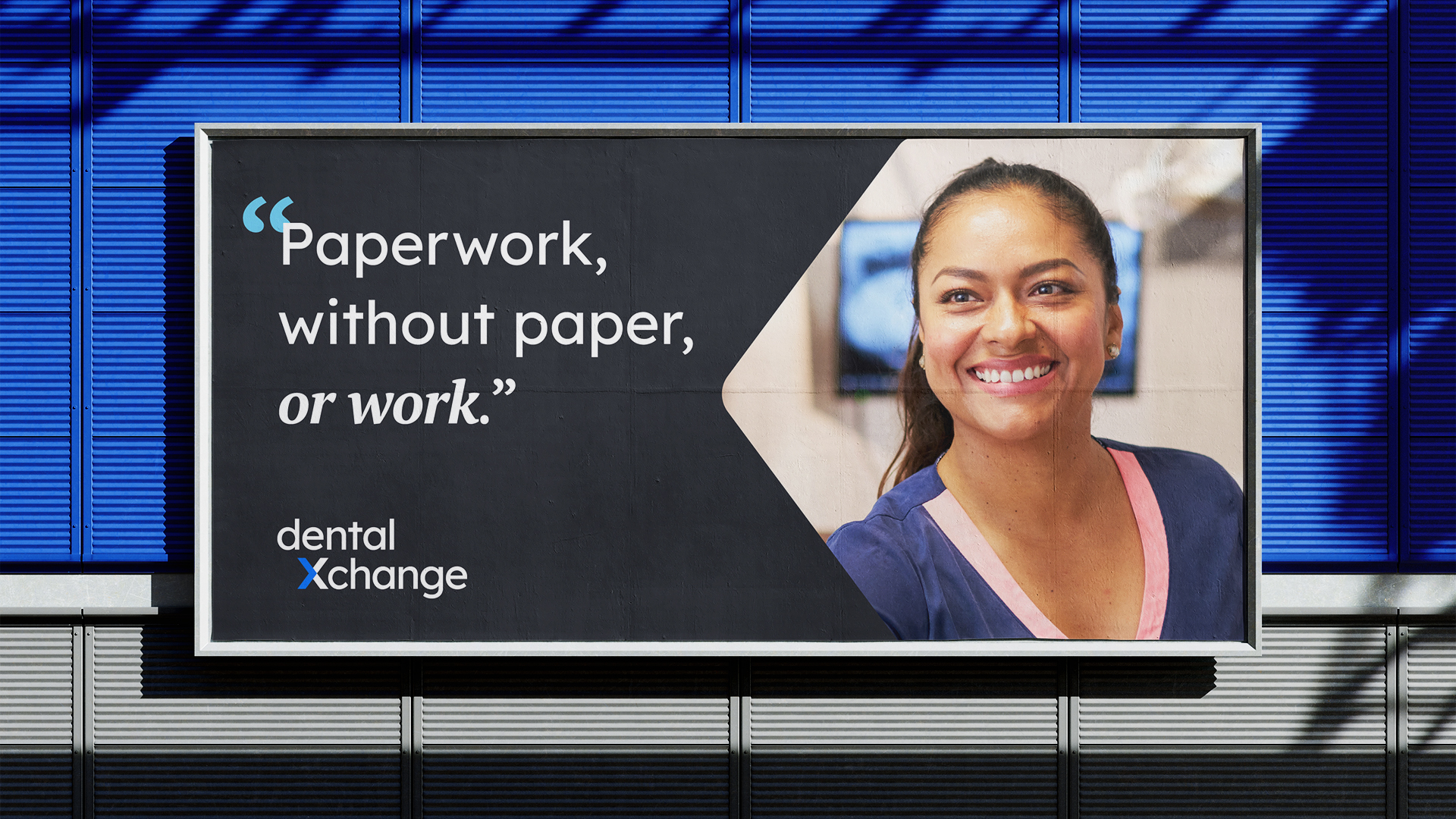
The brand’s palette takes a different approach than that of other brands in the dental technology space. The two shades of blue speak to both ease and innovation while avoiding dental cliche, and the use of a serif typeface for emphasis adds a human touch to the brand typography.


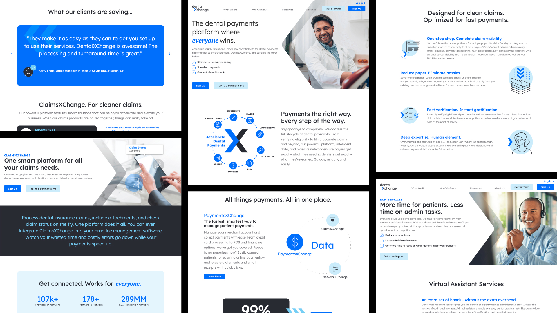
The DentalXChange website’s main purpose was to serve as a hub for people to learn about what DentalXChange does
The DentalXChange website’s main purpose was to serve as a hub for people to learn about what DentalXChange does
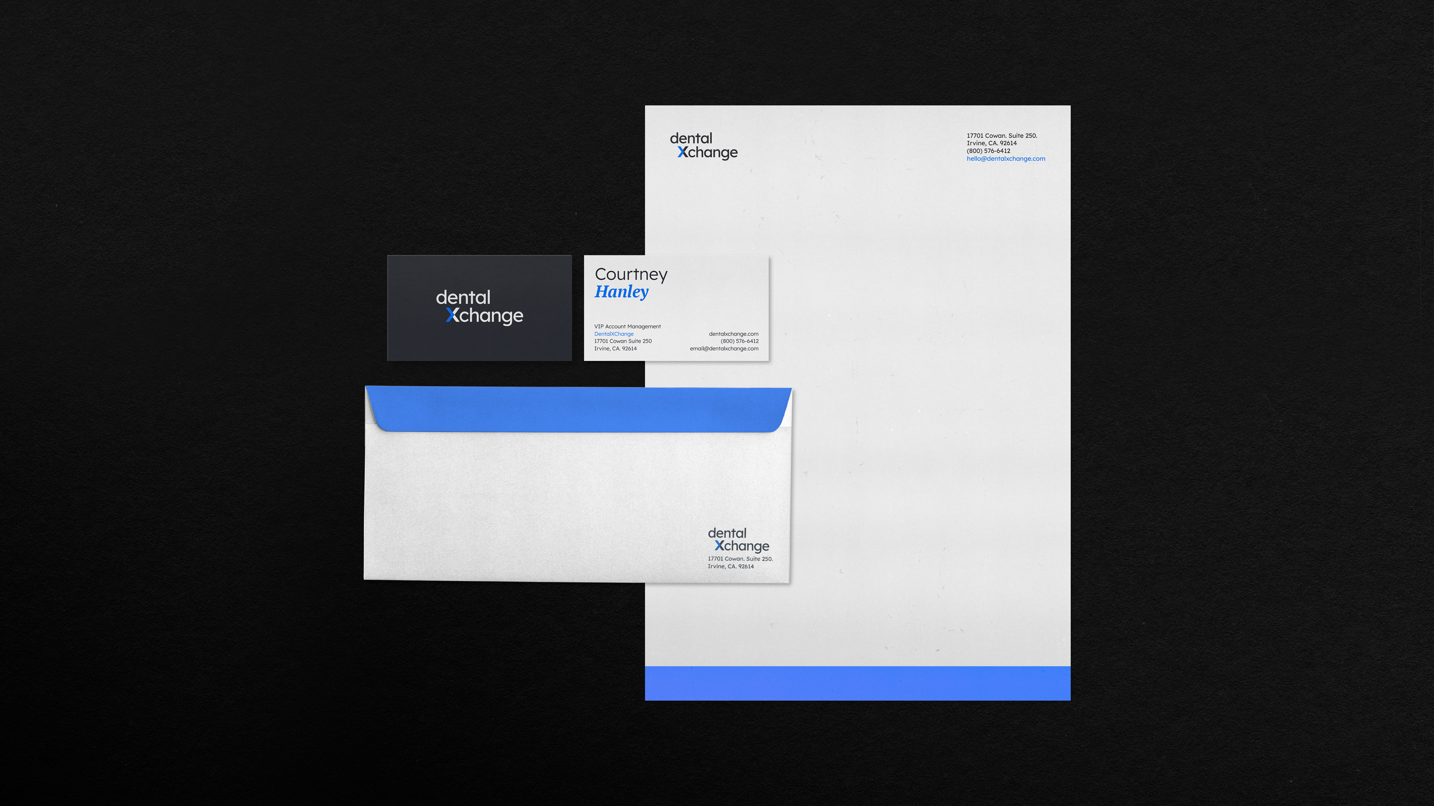
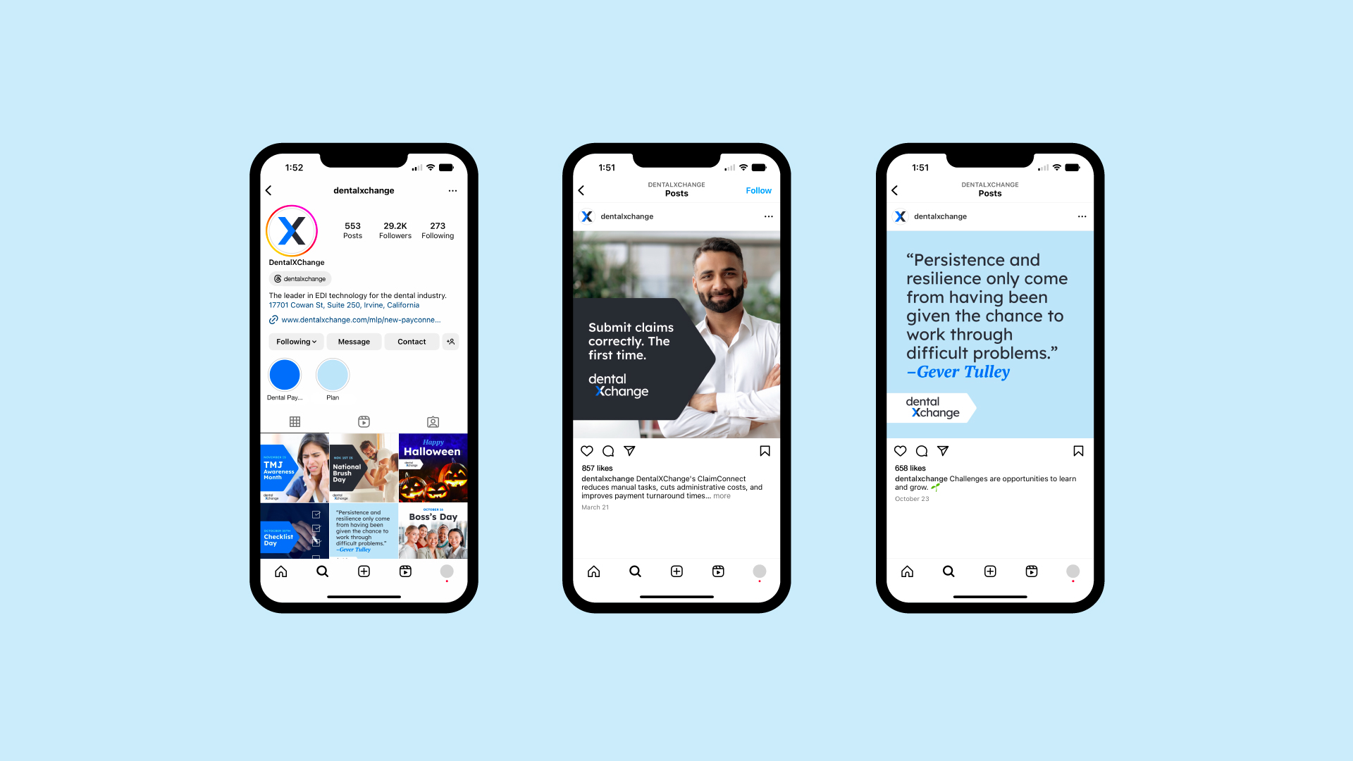
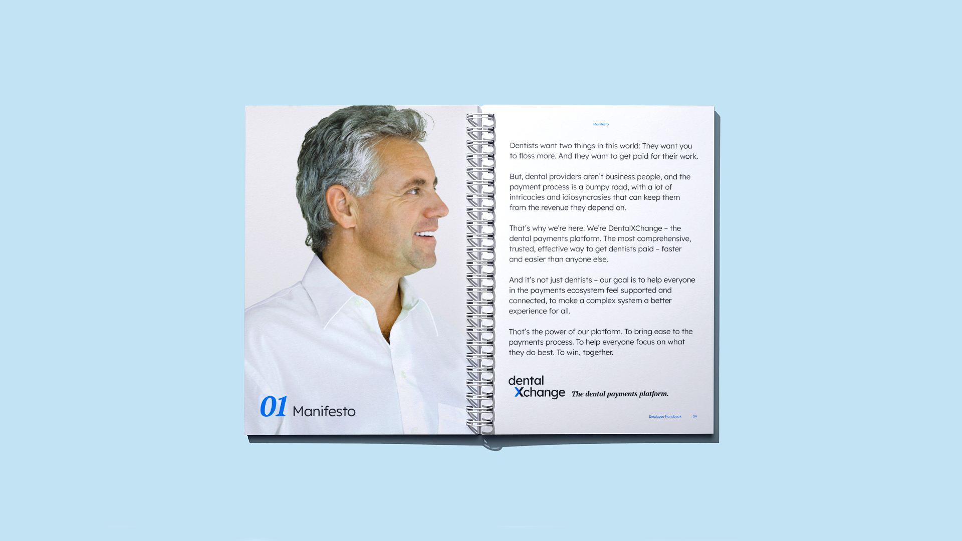
The visual expression continues to find new life in both print and screen applications. From brand collateral and whitepapers to social content, the DentalXChange brand is versatile enough be used in both B2B and B2C scenarios.