Menlo Security
Brand Identity + Visual Expression
BRIEF
Menlo Security wanted to be viewed as a strategic security partner for large organizations, but a strong focus on their technology and tactical use cases prevented them from honing in on their messaging. That’s where WHM came in.
We discovered that the biggest risk point for malware in a given company was individual workers. Many companies believed you had to lock down user access in order to fully secure applications and data. This was a false trade. With Menlo Security you could protect against threats while also protecting user productivity. So, “securing work” became the higher level idea for the brand – a focus on securing the work that people do everyday and allowing them to work without worry.
We discovered that the biggest risk point for malware in a given company was individual workers. Many companies believed you had to lock down user access in order to fully secure applications and data. This was a false trade. With Menlo Security you could protect against threats while also protecting user productivity. So, “securing work” became the higher level idea for the brand – a focus on securing the work that people do everyday and allowing them to work without worry.
ROLE
I contributed directly to the development of the Menlo Security visual brand identity by working on various branded assets. This includeed animating Menlo’s overview video, designing various pages of Menlo’s website, as well as designing and animating custom illustrations which were then used for lead generation campaign advertisements.
TEAM
Sara Correia - Creative Direction
Art Direction - Marcos Calamato
Nicolas Noratto - Design and Motion Graphics
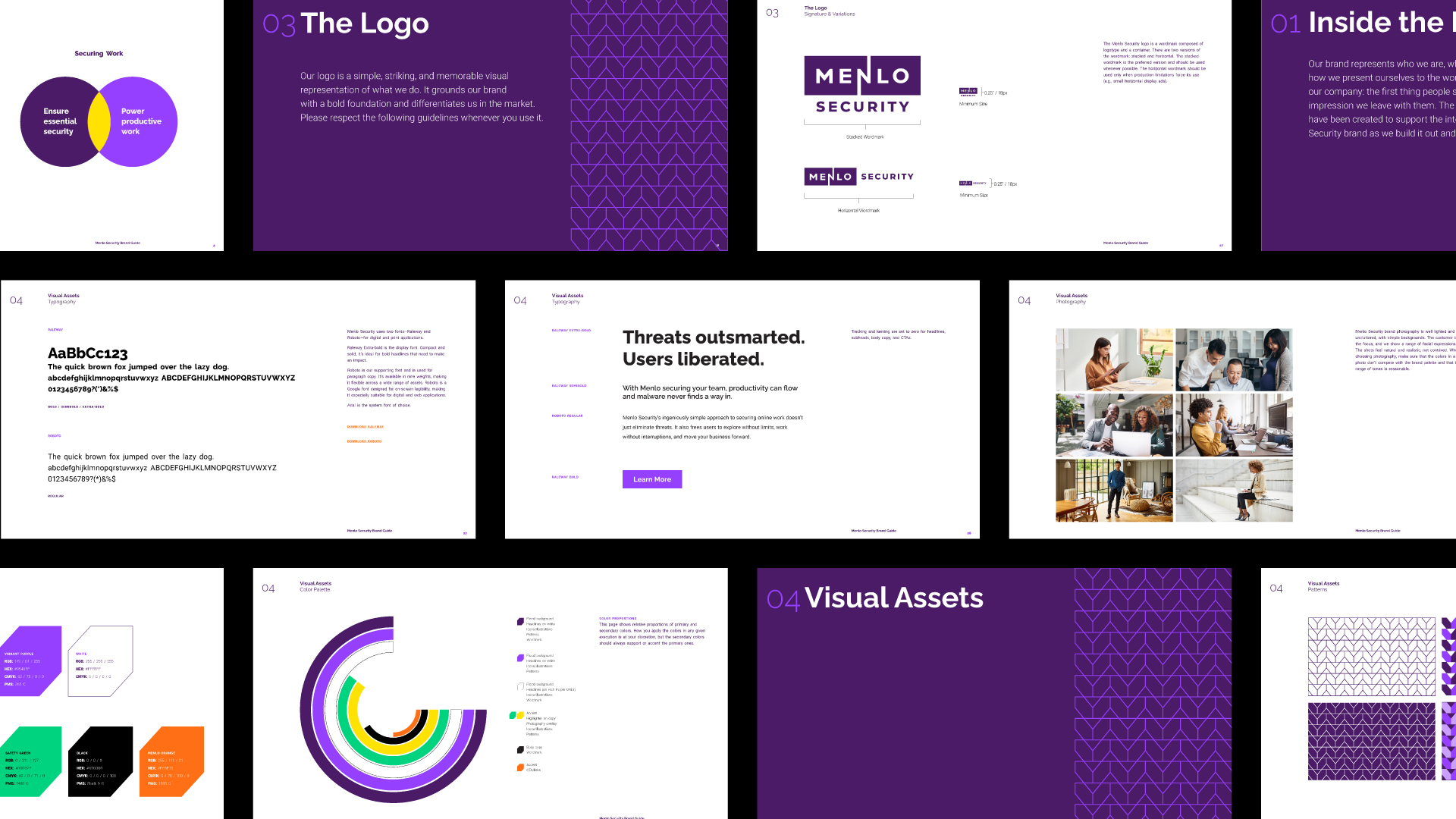
Although preventing and eliminating malware is vital for a cybersecurity company, with Menlo Security you can protect against threats while also protecting user productivity. For that reason, in an effort to uplevel Menlo’s messaging, “Securing Work” became the higher level idea for the brand.


Menlo Security’s legacy lightbulb logo evolved into a more modern wordmark. The lightning bolt shape of the “N” winks at the power of the platform. The word then splits into two parts, creating the shape which speaks to Menlo’s isolation-powered technology platform.


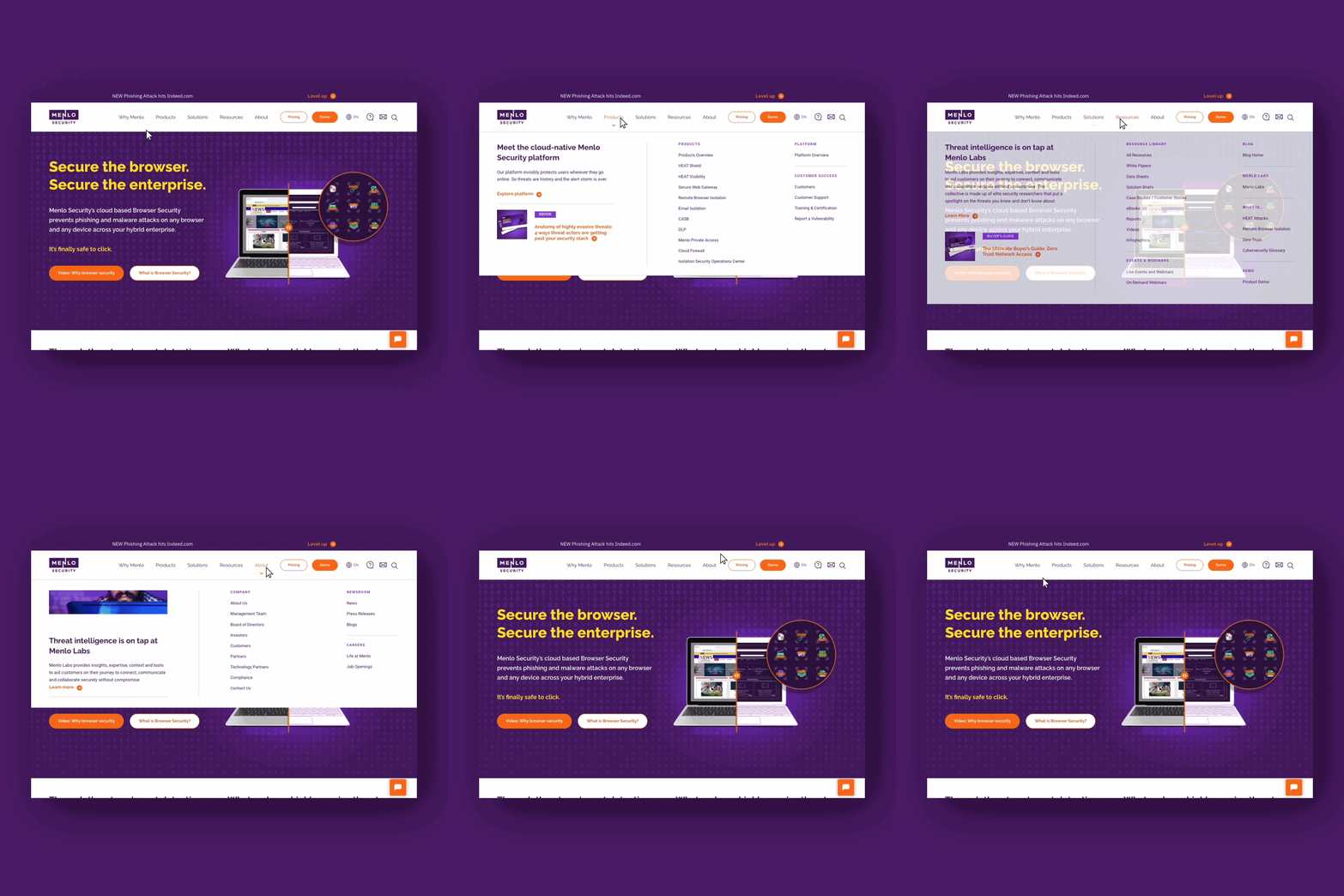
Aside from being a showcase for Menlo Security’s new brand, the main goal behind re-designing Menlo’s website was prioritizing their desire to provide thought leadership through early education and generate enough interest to lead the prospect to learn more.
By creating modular templates for the Menlo website, we were able to design the robust number of pages from Menlo’s extensive site map – and a mega menu to match – with ease.


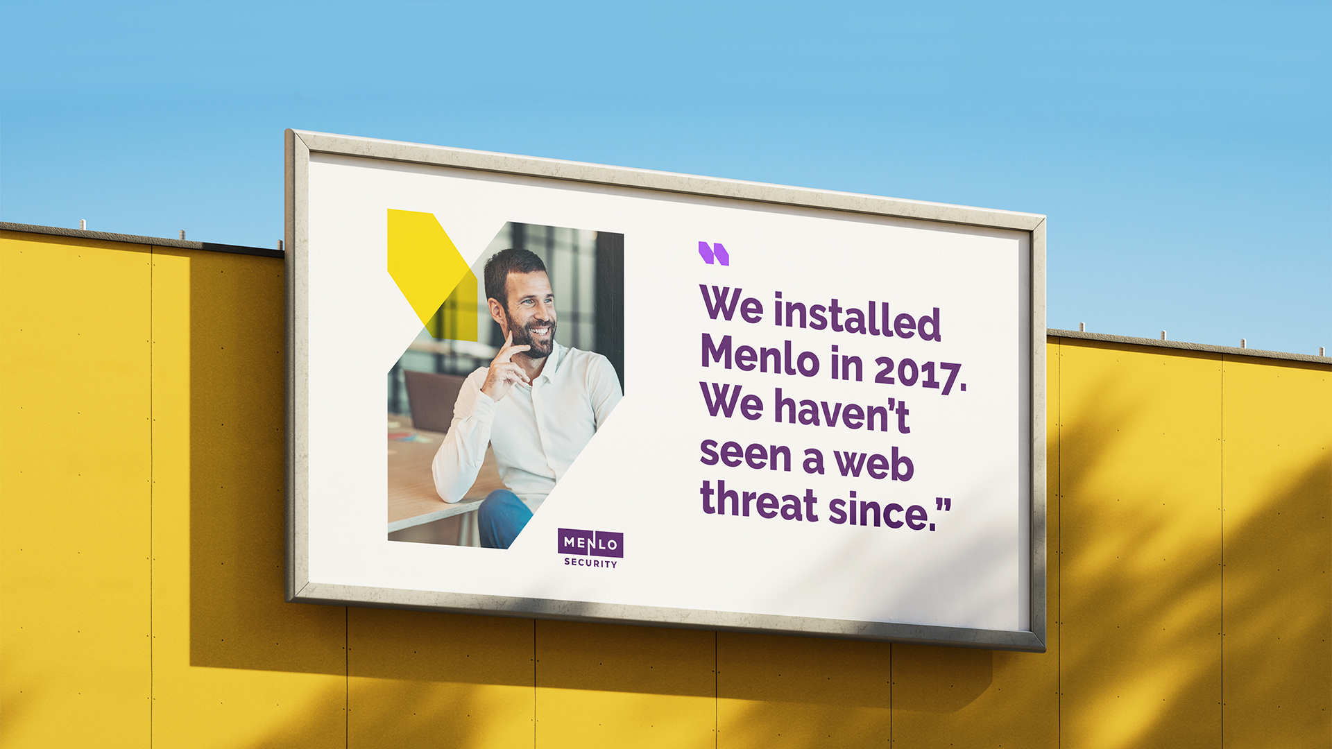
The brand visual expression and tone of voice gave Menlo Security to abilty to convey the concept of ease without having to say it directly. Smart turns of phrase and clever illustrations demonstrate Menlo’s intelligence (and respect for the audience’s intelligence, too).
There is always a unique breeziness to the messaging that aligns with the idea of work without worry.

