N1
Brand Identity + Visual ExpressionBRIEF
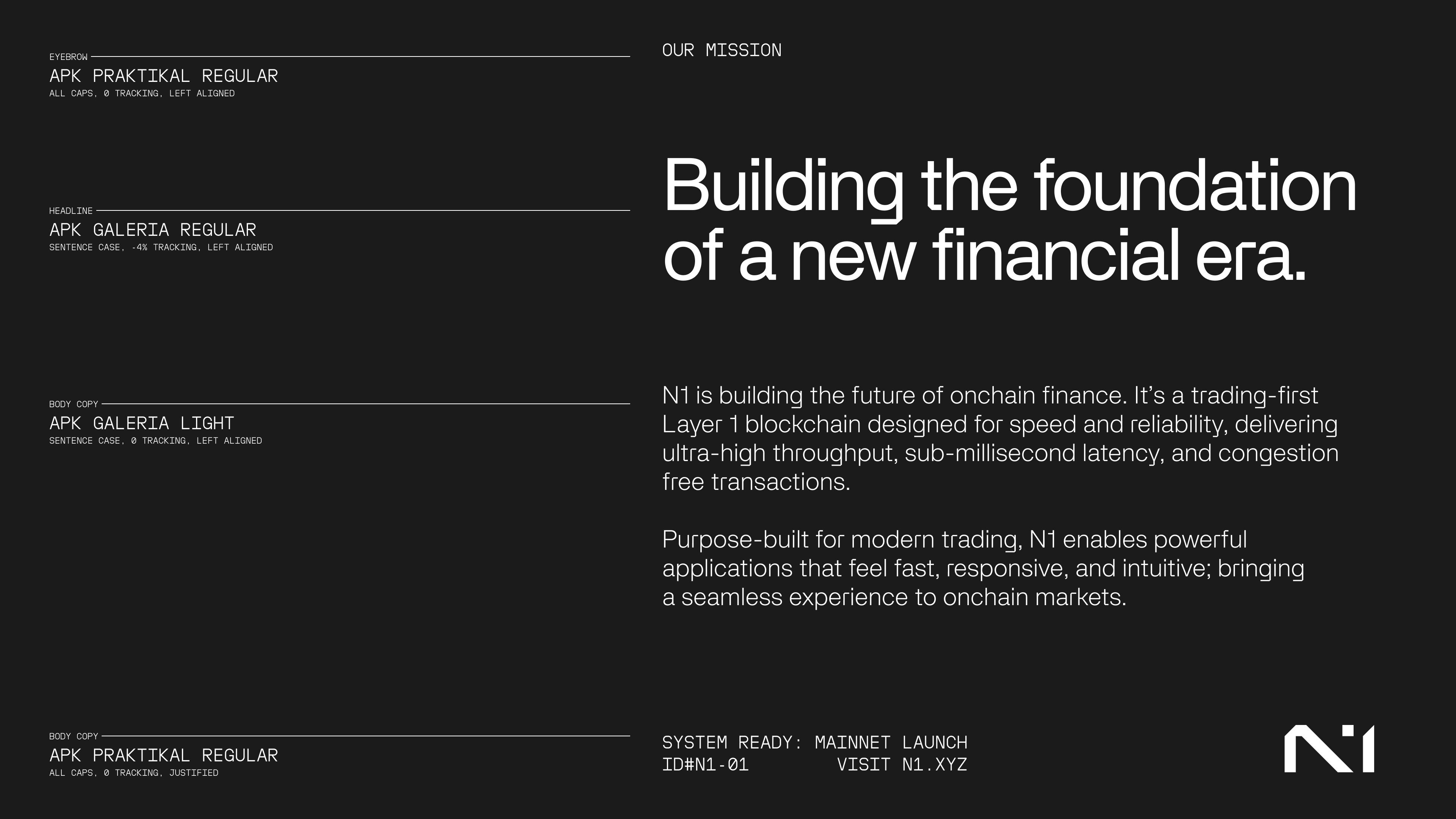
“Building the foundation of a new financial era.”
N1 is a new Layer 1 blockchain built to make the crypto space faster, more connected, and more open. It’s designed to handle over 100,000 transactions per second with near-zero latency, giving developers and users a platform that actually feels fast.
As N1 started building its technology and growing an online presence (eventually reaching over 100K followers on X), the team wanted to stand out in a crowded crypto space that often looks and feels the same.
The goal across every touchpoint was to create a visual language that felt bold, intelligent, and future-facing- reflecting the technical power of the chain while capturing the energy of the people building on it.
ROLE
As the company’s design lead, I worked closely with N1’s co-founders to shape the brand’s visual identity and story. I led the rebrand from the ground up, helping translate technical ideas into a visual system that felt clear, confident, and human.
My role spanned everything from the rebrand launch and website to product UI, social media, and ecosystem work which includes sub-brands like Terminal (N1’s flagship trading app) and collaborations with external app teams building on the chain.
TEAM
Dima Romanov - Co-founder and Creative Oversight
David Cao - Co-founder and Creative Oversight
Nicolas Noratto - Design Lead and Motion Graphics
Conner Brandt - Community Lead and Copywriter

The inspiration for the N1 brand came from recognizing that the platform is built not just for people using crypto, but for the developers building what comes next. The technology supports a growing ecosystem of applications, removing technical roadblocks so that ambitious ideas can run smoothly.
The visual language focuses on possibility and capturing the feeling of working at the edge of something new.
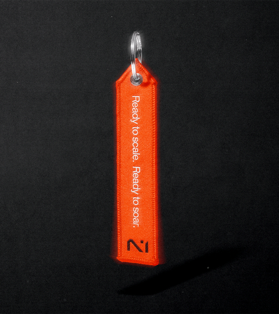
The N1 mark conveys precision, momentum, and modernity. The letterforms are formed by separate shapes, reflecting how the N1 technology is designed: independent layers working as one.
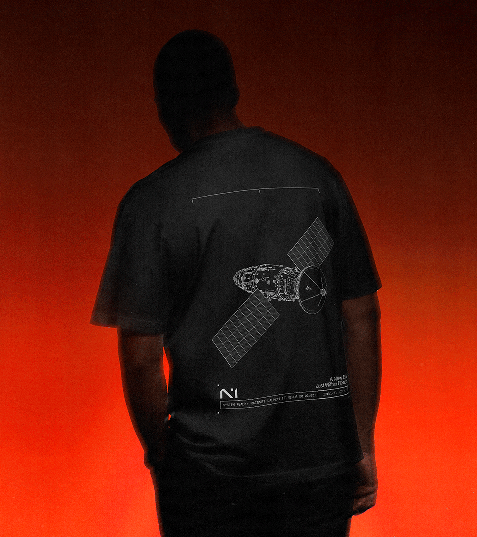
N1’s brand photography pairs emotion and energy with the otherwise clean and modern typographic system. It was important that the brand felt fast and forward-thinking while still staying clear and trustworthy across product and marketing.
The primary photo treatment, which we call Ignition, is inspired by heat and force, like the haze around a rocket engine at launch. It introduces texture and momentum without weakening the brand.
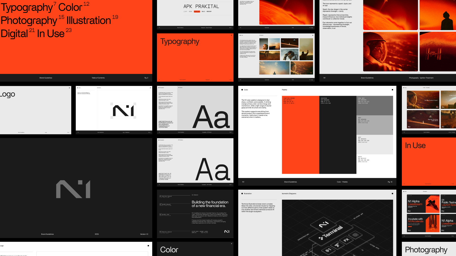


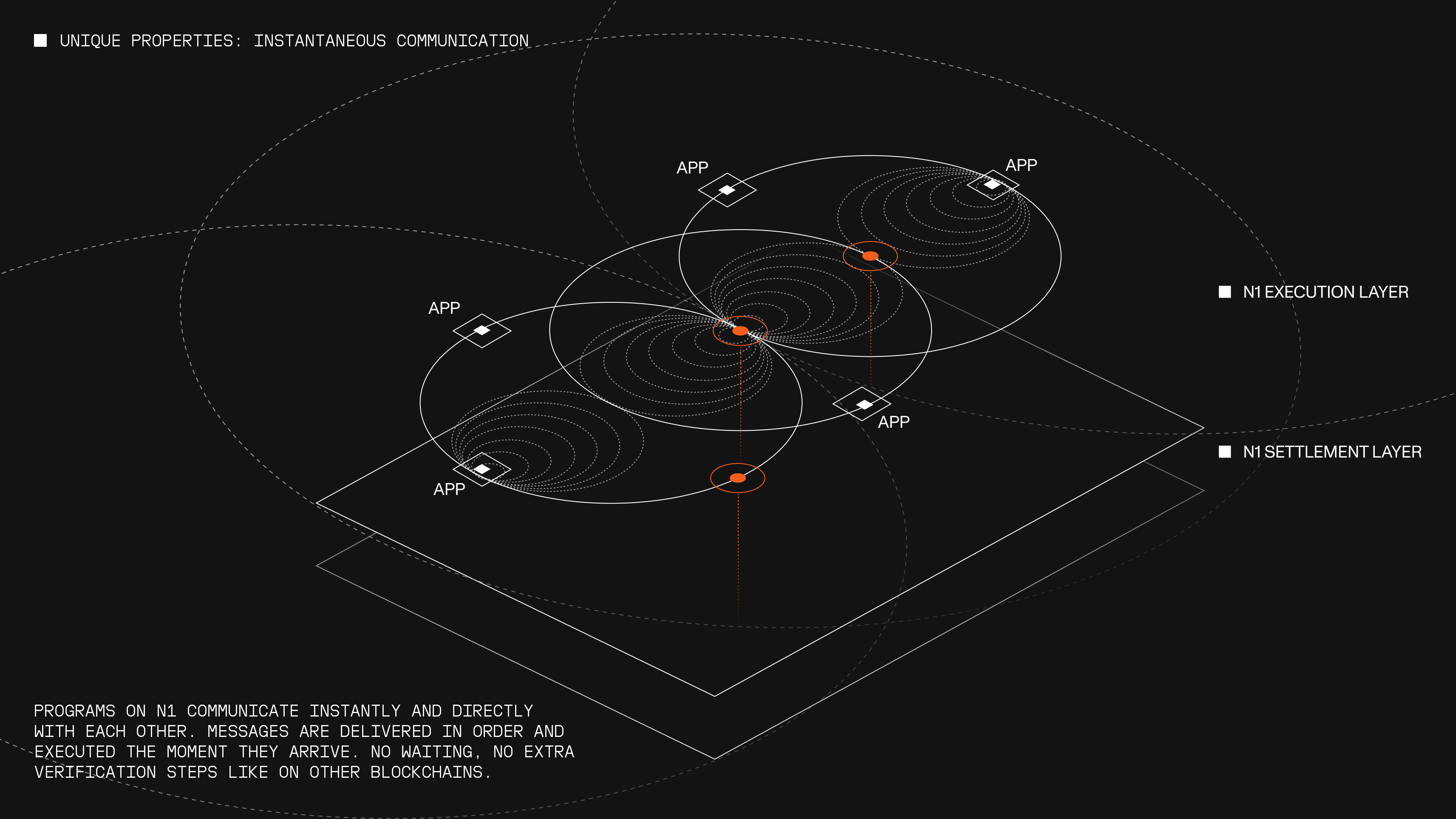
Technical illustrations break down complex ideas into clear, structured visuals by mapping out how different parts of the system relate to one another and where individual products fit within the larger ecosystem.

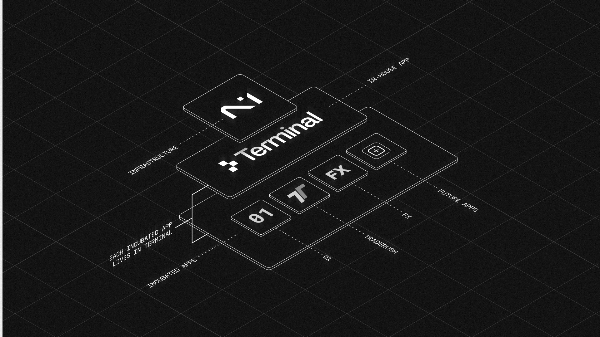
The N1 brand was designed to scale. As the ecosystem grew, that work carried into Terminal, N1’s flagship trading app.
Terminal is a modern trading interface focused on fast execution and usability. We translated the core N1 brand into a product-ready system, applying it across UI, motion, and marketing, and brought it to life through a dynamic launch video.